Multiplicity of well used colour will for sure awe your temperament and make you grin, analyzes Kate Smith, CMG, CfYH
What is it about a grouping of like objects in a variety of colours that delightfully draws our eye? Do you find it almost impossible not to smile when you see something as ordinary as teacups all clad in different colours stacked together? I know it catches my attention too and makes me grin.
The attraction is more than just purely chromatic. Repetition creates rhythm in a design in the same way beats repeated in music create a melody; when the shapes are the same or similar it’s the addition of colour that hit the “high and low notes” in a room.
Seeing repeated shapes in different colours within a home naturally feels as good as singing along with our favourite song. The like shapes give a design unity and the many hues add variety.
When working with multiple colours the best way to harmonize the scheme is to choose three to five colours that have similar intensity or saturation of colour. For example, if the pillows on the sofa are all bright, strong colours. None of the colours grab your attention. The attention drawn by each colour is about equal and this helps to move your eye and add energy to a design.
This does not mean that you must have equal amounts of each colour throughout your interior. When looking at the entire space, it will often be more pleasing to give one or two colours more prominence than the others, and use the other colours to accent the main colours.
Try adding multi-colour magic with paint. You could paint entire rooms in different colours or paint the same neutral throughout with a different accent wall colour in each room. To keep the spaces from feeling disjointed use the colour of one room’s accent wall as accessories in an adjoining room. Mix the proportions of the colours from room-to-room to keep the scheme interesting.
Also think about punctuating an accent wall with squares, lines or circles in a variety of hues, or by using a special textured finish such as Venezia 24/7 or San Deco (available in Kenya at Duracoat Home Solutions, Fedha Valley Arcade, Nairobi).
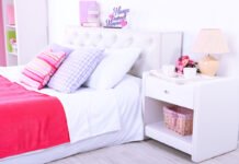
Shape can be joined by like pattern, such as this kaleidoscope of stripes to add another layer of repetition. Using the same pattern in different colours turns these two throw pillows into home accessories worth a second look. Just that slight difference draws attention and gives the mind a reason to pause as it takes in the design.
In 2014, you will see the new Duracoat Framed Attitude colour trends palette, designed especially for Kenya. The palette looks at the possible and lets you think beyond. Self-expressionism is abundant here. The colours are raw and new, giving way to unexpected colour combinations. Using saturated and neutral tones, the palette is taking us forward into a new era.
Using the colours in this fresh palette would be a great place to begin adding multi-colour magic to your home. Mix Arcadia with Suez, Twin Flower and Violette. Use Chicory as a main colour accented by Suez or Golden Age. Go for a fashion-forward scheme that includes Ginger Spice and Violette.
Any combination of colours that express your style can be used together if you follow my tips above. Don’t shy away from incorporating multiple hues. They add an element of happiness and joy to even the most serious design.
Working with multiple colours can be a bit more challenging than working with a limited colour palette, but it can also be great fun. The reward will be in seeing a spontaneous smile whenever someone feels the rhythm of your spirit in your space.
Kate Smith is Chief Colour Maven and President of Sensational Colour, a company that develops colour information to help you confidently select colours for your home. As an internationally recognised colour expert, author and speaker, Kate has been regularly quoted in major media outlets and is a favourite as an on-air guest and speaker at top design conferences and trade shows worldwide. Together with Duracoat, Kate is working in East Africa to provide guidance on how to create colour harmony in your home.


